Share

When people talk about usage-based billing, design isn’t usually the first thing that comes up. Coming from cybersecurity, I thought I had a pretty good handle on complex systems: layers of threats, real-time responsiveness, high-stakes workflows, I figured I was well calibrated for depth. But usage-based billing caught me off guard. At a glance, it looks like a math problem. But under the hood, it’s more of a gnarly intersection of pricing logic, real-time data, user trust, and operational scale. Where every misstep is a UX problem before it's a revenue one.
What surprised me most was just how deeply billing touches every part of the product and every team that builds or supports it. In cybersecurity, the stakes were obvious. In billing, the risks are often quieter, but can be just as devastating. In this industry, I’ve seen how poor design can lead to spreadsheet gymnastics, pricing drift, or surprise invoices that damage trust and churn customers. So in a world where pricing is dynamic, product experiences are fragmented, and revenue teams are stuck reconciling messy workflows, how you design the system: the workflows, the visibility, the trust signals, matters more than most.
After months of working across product, design, and engineering at Metronome, I’ve been meaning to put pen to paper on how we’ve reframed the role of design here. It’s been a quiet but foundational shift, and now feels like the right time to open up about it. Understanding our users deeply and building internal momentum around design strategic thinking were foundational steps. For broader context, I recommend reading our earlier blog, Reinventing Billing with Design: An Interview with Scott, CEO of Metronome, which highlights why design is central to our vision.
Design getting started: Unpacking the real problems
Historically, design at Metronome focused on keeping our UI just polished enough to keep pace with our rapidly evolving APIs. But the longer we worked in this space, the clearer it became that the real problems weren’t just about surface-level visuals, they were about deeply nested usability gaps that could create confusion, inefficiency, and risk. And often times adding more content to an already complex product doesn't help users feel more confident or more in control. If anything, it added more weight to already high cognitive overhead.
When I joined, like in most startups the number of areas we could improve was overwhelming — everything felt important. So we zoomed out and asked: where could design have the most leverage? What changes would create immediate clarity, remove the most guesswork, or prevent the kinds of surprises that lead to unhappy billing owners?
From that vantage point, we started here:
- Internal Efficiency: How can design reduce friction and help teams move faster? By creating intuitive workflows, aligning reusable patterns, and minimizing repetitive support loops.
- External Credibility: How can thoughtful, consistent design build trust and clearly communicate our competence, distinguishing us in a competitive market?
This mindset shift also meant embracing complexity as part of the design challenge. Usage-based billing touches multiple personas, finance leaders grappling with tax compliance and forecasting, RevOps managing revenue leakage and pricing drift, and customer success fielding ticket after ticket over confusing invoices. All of these stem from misaligned or insufficient UX patterns. We saw this first hand with pain points like hard-coded rate logic, sticker-shock invoices, and lack of self-serve visibility.
This strategic reframing echoes CEO Scott Woody’s take that “good design starts and ends with the customer.” It’s a reminder that design is as much about reducing friction and building trust as it is about shipping features.
Building leverage by knowing where to look
One of our first steps was untangling the sprawl: personas, workflows, edge cases that all blended into noise. We knew design wouldn’t gain leverage without a much sharper view of our users: how they work, where they stall, and which pain points actually matter most. So we dug in.
Our intensive research into creating a Persona Ecosystem and Golden User Journeys gave us a clearer lens on the roles and moments that drive impact. That work both informed our design decisions and, even more critically, it laid the foundation for a shared language across product, design, and engineering. It also helped surface the real blockers: spreadsheet gymnastics in Billing Ops, Growth PMs held back by hardcoded pricing, confused end users with no visibility into what they were paying for. These weren’t edge-case behaviors. It was the actual product experience.
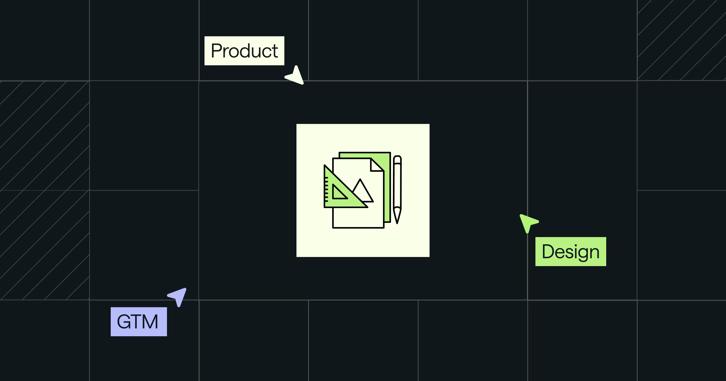
Looking across all these pain points, we noticed they clustered around three critical moments: users couldn't see what was possible with their billing needs, they hesitated to act on visible options, or they acted without trusting the results. This gave us a clearer way to think about where design could intervene. We then built a simple model to frame how design should show up — anchored in what our users actually need from the product:
This became our Design Opportunity Framework. It gave the design team a shared language to focus design energy where it matters most. Instead of reacting to scattered requests or treating polish as the finish line, we started asking better questions: Are we revealing the right possibilities clearly? Are we helping users act with confidence? Do they trust what they’re seeing?
Our product design principles gained sharper edges through this lens. We focused on reducing handoffs, tightening workflows, and making the interface feel consistent, because predictability builds trust.
It also helped us reframe persistent issues as solvable design challenges. Is Billing Ops spending days stitching spreadsheets? That’s a visibility problem. Are PMs unable to test pricing without engineering support? That’s a flexibility problem. Are end users unsure why their invoice looks the way it does? That’s a clarity and trust problem. None of these were niche cases; they were central to the experience. And it allowed design sit in the driver's seat to impact material change.
So we built a new muscle
Yet there was a ceiling to our speed. Like most design organizations within tech, you quickly become limited by the engineering resourcing to make it possible. To truly scale, we needed a more transformative approach.
Enter: vibe coding.
Just when you thought this wasn’t another article on 'how this company is leveraging AI' . . . 😬! But to call what we’re trying to do over in Metronome as simple vibe coding really isn’t giving enough credit to our Design AI program as a whole.
We wanted to be faster in collaboration between differing orgs. We wanted to be faster collecting research and qualifying the right things to build. We wanted to be faster in shipping product.
But it wasn’t just about speed. It’s about removing the friction between knowing what to do and making it real. In early 2025, we started running structured experiments to push on this. And what we saw was momentum: tighter feedback loops, faster iteration, and more confidence shipping into high-friction areas.
This wasn’t just about design tooling, either; it was about design leading. Vibe coding gave us the agency to fix friction ourselves, and in doing so, kicked off a company-wide shift in how we use AI to accelerate product quality.
And the small breakthroughs that helped us reimagine what design can do in a product-led, AI-powered company.
What’s next
The next few posts in this series will walk through our journey. Not just the wins, but the messy middle. The false starts. The tooling trials. Some of it will feel familiar in your own exploration. Some might push on how we define what design work looks like. That’s the point.
If you’re a designer trying to build more leverage, a PM trying to move faster, or a team trying to break the cycle of “we know what’s broken but can’t fix it” — we’ve been there, and this series is for you.